 CrazyGL
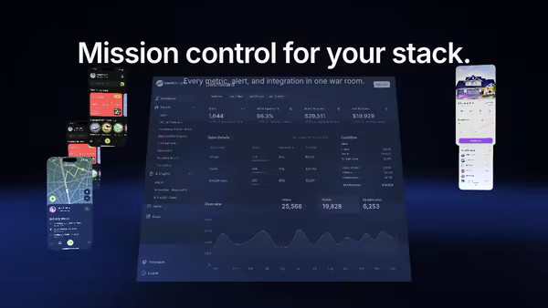
Notification Storm
Tiny notification, message, alert and success cards stream from deep space toward a tilted product dashboard, curving inward under a magnetic pull and brightening on arrival. Hover anywhere to slow the storm to a crawl.
Usage
import NotificationStorm from '@crazygl/hero-notification-storm';
export default function Page() {
return (
<NotificationStorm
heading="All your activity, organized."
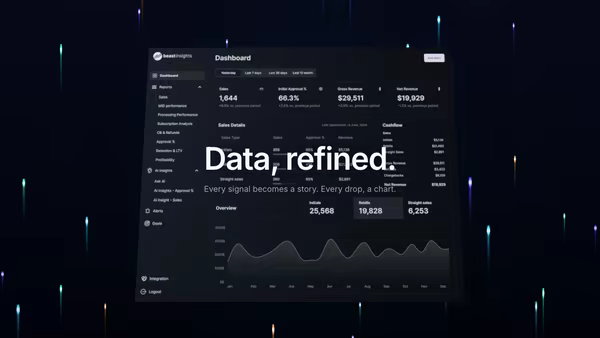
screenshot="https://crazygl.com/samples/screenshot-dashboard-dark.avif"
notificationStyle="ios-dark"
revealStyle="stream"
/>
);
}Customise
- Screenshot —
screenshot(central dashboard; aspect read from the image) plusscreenshotX/Y,screenshotScale,screenshotTilt,screenEmissive. - Notifications —
notificationStyle(ios-dark/light,android-dark/light,web-dark/light),revealStyle(stream/drop-in/fade-in/pop),notifications(one per lineapp | title | body),useAppIcons+appIconColors. - Cards —
cardCount(4–30),cardSize. - Motion —
flowSpeed,pullStrength(magnetic pull),parallaxStrength. - Atmosphere —
haloColor/haloStrength,bgCenter/bgEdge,transparentBackground.
Best for
- CRMs, support and ticketing tools
- Monitoring, observability, and analytics dashboards
- AI agent inboxes and activity feeds — "every event, sorted at the center"
One command, zero config.
npm install @crazygl/hero-notification-stormImport once, drop it in.
The component takes the same props you see in the live customizer on the right — every default ships poster-quality.
import NotificationStorm from '@crazygl/hero-notification-storm';

export default function Landing() {
  return (
    <NotificationStorm />
  );
}SSR-safe by default.
The wrapper renders static HTML on the server and only initialises the canvas after hydration, so search engines see your copy.
// app/page.tsx — works in SSR-first frameworks (Next, Remix, Astro, etc.)
'use client';

import NotificationStorm from '@crazygl/hero-notification-storm';

export default function Page() {
  return (
    <section>
      <NotificationStorm
        heading="Say hi."
        subheading="Your new hero."
      />
      <article>
        <h2>Welcome</h2>
        <p>Your content keeps its own voice below the hero.</p>
      </article>
    </section>
  );
}