CrazyGLCrazyGLHomeExploreGitHubBrowse heroesLoading hero…← Back to gallery@crazygl/collection-carousel

Collection Carousel

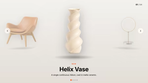
Product cards float in a curved 3D carousel. The center card is large and sharp; cards rotating toward the sides shrink, dim and blur into depth. Auto-rotates slowly, drag to spin with momentum, click a side card to bring it to center.

ReactWebGL3DImageInteractiveFont#three#3d#carousel#ecommerce#product#collection#catalog#shop#ring#showcase

Usage

import CollectionCarousel from '@crazygl/hero-collection-carousel';

export default function Hero() {
  return (
    <CollectionCarousel
      productCount={6}
      product1Image="/shop/linen.jpg"
      product1Title="Coastal Linen"
      product1Price="$128"
      depthFalloff={0.6}
      accentColor="#e8b06a"
    />
  );
}

Customise

  • Content — overlay heading/subheading, two-columns, or custom node.
  • Products — up to 8 slots, each with image, title, price, and an onCardNClick link/handler; showLabels toggles the composited title/price.
  • CarouselcurveRadius, cardSpacing, cardCornerRadius, depthFalloff, autoRotateSpeed, reflectionStrength.
  • InteractiondragSensitivity, momentumDecay.
  • StyleaccentColor, bgTop, bgBottom.

Best for

  • Fashion, apparel, and homeware ecommerce collections.
  • "Shop the edit" / curated lookbooks on product landing pages.
  • Premium product-category showcases that benefit from a tactile turntable.
01 · Install the package

One command, zero config.

npm install @crazygl/hero-collection-carousel
02 · Render the component

Import once, drop it in.

The component takes the same props you see in the live customizer on the right — every default ships poster-quality.

hero.tsx
import CollectionCarousel from '@crazygl/hero-collection-carousel';

export default function Landing() {
  return (
    <CollectionCarousel />
  );
}
03 · Use it in a page

SSR-safe by default.

The wrapper renders static HTML on the server and only initialises the canvas after hydration, so search engines see your copy.

page.tsx
// app/page.tsx — works in SSR-first frameworks (Next, Remix, Astro, etc.)
'use client';

import CollectionCarousel from '@crazygl/hero-collection-carousel';

export default function Page() {
  return (
    <section>
      <CollectionCarousel
        heading="Say hi."
        subheading="Your new hero."
      />
      <article>
        <h2>Welcome</h2>
        <p>Your content keeps its own voice below the hero.</p>
      </article>
    </section>
  );
}
You might also like

Similar heroes

Multi-Screen Orbital Carousel

A ring of product screenshots orbits slowly around the hero in 3D space. The front card faces the camera and pops larger; the others recede into a depth-fogged background. Drag to spin, then let the ring glide back to its idle rotation.

Product Carousel

A centred showcase carousel for transparent product PNGs — the active product sits front and large while the previous and next peek in from the sides, dimmed and scaled. Swipe, drag, arrows or dots; products swing into frame with captions that animate in.

Carousel of Product Toys

A slowly turning toy shelf — 5–8 chunky plastic-toy product icons rotate around the headline like collectibles on a display stand. Hover a toy to bring it forward; click to navigate.

Screenshot in a Floating Metal Frame

Your product screenshot held inside a brushed-metal frame, lit like a physical product photograph. The frame sits at an adjustable static angle, tilts with the pointer for parallax, and optionally rotates to catch studio highlights.

White Infinity Studio

A 3D product GLB floats in a bright seamless infinity studio — the floor sweeps continuously up into the back wall with no visible seam. Three-point softbox lighting, a soft floor reflection, and a very subtle camera dolly sell the look of a premium catalogue photoshoot.

Masked Text Carousel

A big heading sits behind a product image; where the image overlaps the words the text shows only its outline (or inverts, or ghosts) while the rest stays solid — the product literally masks the type. Swipeable, with a floating, pointer-reactive product and smooth slide transitions.
Live customizer

Collection Carousel

Product count6How many product cards sit on the ring. Below 4 the ring feels sparse; 5–7 reads as a full catalog.Product 1 imageJPG / PNG / AVIF / WebP. Images are cover-fit, so any aspect works without stretching.Product 1 titleProduct 1 priceProduct 1 link / actionURL to navigate to when this card is clicked, or leave empty to do nothing. In code you can also pass a function.Product 2 imageProduct 2 titleProduct 2 priceProduct 2 link / actionProduct 3 imageProduct 3 titleProduct 3 priceProduct 3 link / actionProduct 4 imageProduct 4 titleProduct 4 priceProduct 4 link / actionProduct 5 imageProduct 5 titleProduct 5 priceProduct 5 link / actionProduct 6 imageProduct 6 titleProduct 6 priceProduct 6 link / actionShow title & priceOverlay each product's title and price along the bottom of the card.Curve radius3.1worldRadius of the carousel ring. Larger = flatter curve, cards spread wider; smaller = tighter wrap.Card spacing1Card size relative to the gap between ring slots. 1.0 = nearly touching, lower = airy gaps.Card corner radius0.06relRounded corner radius relative to card height.Depth falloff0.6How much side cards dim and depth-blur as they rotate away from center. 0 = all equal, 1 = strong focus on center.Auto-rotate speed0.07Continuous catalog-browse rotation rate. 0 = static, 0.2 ≈ one revolution every ~30s, 1.0 ≈ one revolution every ~6s. Pauses under reduced motion.Floor reflection0.4Opacity of the soft mirror reflection of the cards on the floor. 0 = none.Drag sensitivity1How far the ring spins relative to drag distance.Momentum decay0.94How long the spin glides after release. 0.99 = long coast, 0.85 = quick stop.AccentTints the floor glow, the price text, and the light wash on the center card.Background topBackground bottomInteractivityWhich input drives the hero — try Scroll if you want the page to drive motion.
CrazyGL · crazygl.comProgrammable hero sections for real websites.