 CrazyGL
Product Carousel
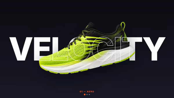
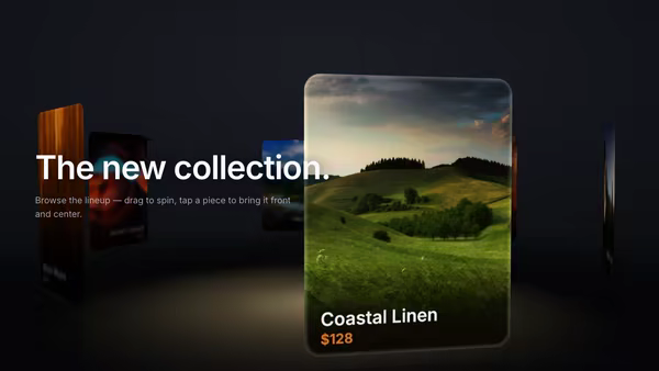
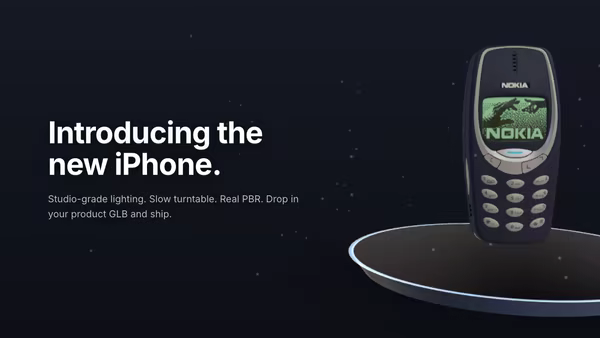
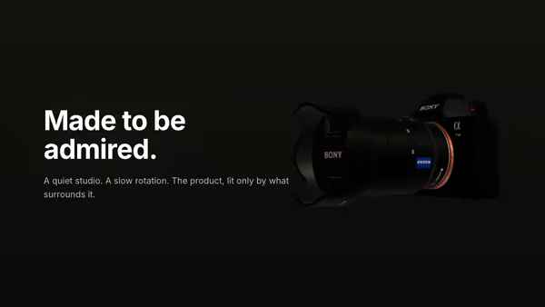
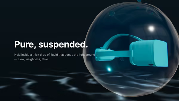
A centred showcase carousel for transparent product PNGs — the active product sits front and large while the previous and next peek in from the sides, dimmed and scaled. Swipe, drag, arrows or dots; products swing into frame with captions that animate in.
Usage
import ProductCarousel from '@crazygl/hero-product-carousel';

export default function Page() {
  return (
    <ProductCarousel
      slideCount={4}
      slide1Image="https://crazygl.com/samples/product-vase.png"
      slide1Heading="Helix Vase"
      autoplay
    />
  );
}
Customise
- Slides —
slideCount(1–6) plus per-slideslideNImage/slideNEyebrow/slideNHeading/slideNSubtext. - Layout —
spacing(side spread),sideScale,sideOpacity,sideBlur,pointerParallax,tiltSides,floorshadow. - Motion —
duration,easing(expo / smooth / back / ease),textTransition(fade / rise / clip / blur),autoplay,interval. - Style —
bgTop/bgBottombackdrop,textColor,accentColor,showArrows/showDots/showCounter,headingFont/bodyFont.
Best for
- E-commerce product launches and DTC landing pages.
- Furniture, gadget, and lifestyle catalogues with clean PNG cut-outs.
- Portfolio or collection showcases that need swipe/drag navigation.
One command, zero config.
npm install @crazygl/hero-product-carouselImport once, drop it in.
The component takes the same props you see in the live customizer on the right — every default ships poster-quality.
import ProductCarousel from '@crazygl/hero-product-carousel';

export default function Landing() {
  return (
    <ProductCarousel />
  );
}SSR-safe by default.
The wrapper renders static HTML on the server and only initialises the canvas after hydration, so search engines see your copy.
// app/page.tsx — works in SSR-first frameworks (Next, Remix, Astro, etc.)
'use client';

import ProductCarousel from '@crazygl/hero-product-carousel';

export default function Page() {
  return (
    <section>
      <ProductCarousel
        heading="Say hi."
        subheading="Your new hero."
      />
      <article>
        <h2>Welcome</h2>
        <p>Your content keeps its own voice below the hero.</p>
      </article>
    </section>
  );
}