 CrazyGL
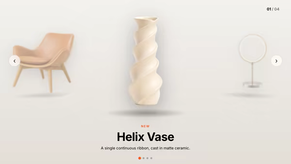
Gallery Slider
A full-bleed image gallery where each slide carries its own picture and copy. Image and text transition independently — fade, Ken-Burns zoom, push-slide, clip wipe or blur-morph for the image; fade, rise, clip-reveal or blur for the text. Autoplay, arrows, dots, counter, swipe.
Usage
import GallerySlider from '@crazygl/hero-gallery-slider';

export default function Page() {
  return (
    <GallerySlider
      slideCount={3}
      imageTransition="blur"
      textTransition="clip"
      slide1Image="/img/one.jpg"
      slide1Heading="Tiered in white sugar"
      slide1CtaLabel="Discover"
      slide1CtaHref="/products"
    />
  );
}
Customise
- Slides —
slideCount(1–5) and per-slideslideNImage,slideNEyebrow,slideNHeading,slideNSubtext,slideNCtaLabel,slideNCtaHref. - Transitions —
imageTransition,textTransition,duration,easing, and ambientkenBurns. - Playback —
autoplay,interval, and toggles forshowArrows,showDots,showCounter,showProgress. - Style —
textPosition,textColor,accentColor,scrim,headingFont/bodyFont, and CTActaColor/ctaTextColor/ctaShape.
Best for
- Hospitality, fashion, and luxury-brand landing pages that lead with photography.
- Product showcases and editorial "chapters" where each slide tells one beat of a story.
- Portfolios and case-study reels that need cinematic image-to-image transitions.
One command, zero config.
npm install @crazygl/hero-gallery-sliderImport once, drop it in.
The component takes the same props you see in the live customizer on the right — every default ships poster-quality.
import GallerySlider from '@crazygl/hero-gallery-slider';

export default function Landing() {
  return (
    <GallerySlider />
  );
}SSR-safe by default.
The wrapper renders static HTML on the server and only initialises the canvas after hydration, so search engines see your copy.
// app/page.tsx — works in SSR-first frameworks (Next, Remix, Astro, etc.)
'use client';

import GallerySlider from '@crazygl/hero-gallery-slider';

export default function Page() {
  return (
    <section>
      <GallerySlider
        heading="Say hi."
        subheading="Your new hero."
      />
      <article>
        <h2>Welcome</h2>
        <p>Your content keeps its own voice below the hero.</p>
      </article>
    </section>
  );
}