 CrazyGL
Drop Cap
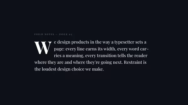
Editorial paragraph with a single, oversized serif drop-cap that overhangs the leading margin — drop straight into a magazine layout.
Usage
import DropCap from '@crazygl/hero-dropcap';

export default function Hero() {
  return (
    <DropCap
      body="It begins with a single letter — a quiet kind of restraint."
      dropCapColor="#ffd86b"
      dropCapSize={5}
    />
  );
}
Customise
- Content —
bodyparagraph text (the first character becomes the drop-cap). - Drop-cap —
dropCapColor,dropCapSize(em scale),dropCapLines(lines spanned). - Typography —
textColor,fontSize,headingFontFamily(Google font),headingFontWeight,lineHeight. - Backdrop —
transparentBackground,bgColor.
Best for
- Editorial / magazine landing pages and long-form intros.
- Blog or essay headers that want a literary, print feel.
- Brand stories where typography carries the tone.
One command, zero config.
npm install @crazygl/hero-dropcapImport once, drop it in.
The component takes the same props you see in the live customizer on the right — every default ships poster-quality.
import DropCap from '@crazygl/hero-dropcap';

export default function Landing() {
  return (
    <DropCap />
  );
}SSR-safe by default.
The wrapper renders static HTML on the server and only initialises the canvas after hydration, so search engines see your copy.
// app/page.tsx — works in SSR-first frameworks (Next, Remix, Astro, etc.)
'use client';

import DropCap from '@crazygl/hero-dropcap';

export default function Page() {
  return (
    <section>
      <DropCap
        heading="Say hi."
        subheading="Your new hero."
      />
      <article>
        <h2>Welcome</h2>
        <p>Your content keeps its own voice below the hero.</p>
      </article>
    </section>
  );
}