 CrazyGL
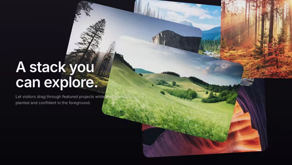
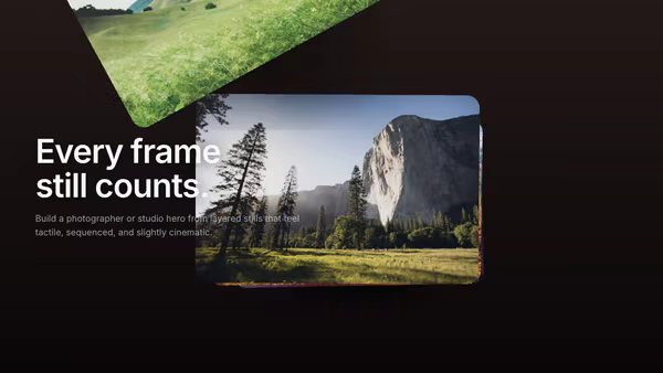
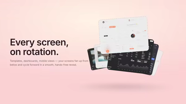
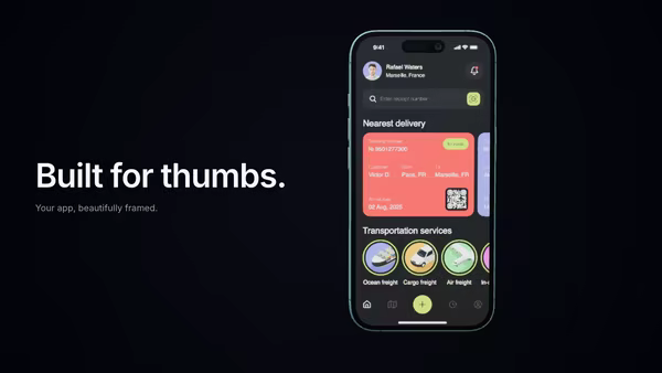
Screenshot as a 3D Card Stack
Your main product screenshot sits on top of a stack of secondary UI cards. The front card swoops up and over to the back at a configurable interval, autonomously cycling through every screen. Soft drop shadows, a cyan edge glow on the top card, cursor parallax tilt.
Usage
import HeroCardStack from '@crazygl/hero-card-stack';

export default function Hero() {
	return (
		<HeroCardStack
			heading="One product, every module."
			subheading="Watch the deck cycle through every screen."
			screenshot1="/screens/dashboard.png"
			screenshot2="/screens/builder.png"
			screenshot3="/screens/editor.png"
			cycleInterval={3.5}
		/>
	);
}
Customise
- Content —
heading/subheading, or switchcontentTypetotwo-columns/customfor richer copy. - Screenshots —
screenshot1..5, one image per card. Screenshot 1 is the top (most visible) card, 5 is the bottom. Each card adopts its image's own aspect ratio. - Stack —
cardCount(2–6),stackOffsetX/Y/Z,cardSize,cardCornerRadius, plusgroupOffsetX/Yto position the whole deck. - Flip cycle —
flipCycletoggles the auto-cycle;cycleInterval(seconds) sets the pace. - Motion —
cursorTiltfor pointer parallax,ambientFloatfor a gentle continuous bob. - Style & lighting —
edgeGlowColor/edgeGlowStrength,shadowStrength,keyColor/fillColor,screenBrightness, andbgTop/bgBottomgradient.
Best for
- SaaS landing pages with multiple modules — dashboards, app builders, template galleries.
- Multi-product suites or design tools that want to show several screens at once.
- Product launches where an auto-cycling reel of screenshots tells the story hands-free.
One command, zero config.
npm install @crazygl/hero-card-stackImport once, drop it in.
The component takes the same props you see in the live customizer on the right — every default ships poster-quality.
import ScreenshotAsA3DCardStack from '@crazygl/hero-card-stack';

export default function Landing() {
  return (
    <ScreenshotAsA3DCardStack />
  );
}SSR-safe by default.
The wrapper renders static HTML on the server and only initialises the canvas after hydration, so search engines see your copy.
// app/page.tsx — works in SSR-first frameworks (Next, Remix, Astro, etc.)
'use client';

import ScreenshotAsA3DCardStack from '@crazygl/hero-card-stack';

export default function Page() {
  return (
    <section>
      <ScreenshotAsA3DCardStack
        heading="Say hi."
        subheading="Your new hero."
      />
      <article>
        <h2>Welcome</h2>
        <p>Your content keeps its own voice below the hero.</p>
      </article>
    </section>
  );
}