 CrazyGL
Animated Text Gradient
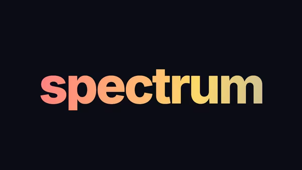
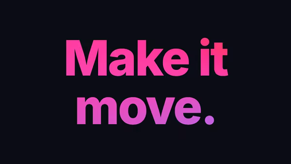
A heading filled with a slowly-shifting multi-stop gradient that loops across up to five user colours, with controllable angle and speed.
Usage
import AnimatedTextGradient from '@crazygl/hero-animated-text-gradient';

export default function Hero() {
  return (
    <AnimatedTextGradient
      heading={"Animated\nGradient Text"}
      color1="#ff6b6b"
      color2="#4ecdc4"
      useColor3
      color3="#45b7d1"
      animationSpeed={8}
      gradientAngle={90}
    />
  );
}
Customise
- Content —
heading(supports\nline breaks). - Gradient —
color1/color2plus optionalcolor3–color5(each gated by auseColorNtoggle),gradientAngle(0–360°) andanimationSpeed(full loop in seconds). - Typography —
fontSize,letterSpacing,textAlign,headingFontFamily(Google Font),headingFontWeight. - Backdrop —
transparentBackgroundtoggle andbgColor.
Best for
- Brand wordmarks and design-system showcases that lean on an accent palette.
- AI / fintech / e-commerce landing hero blocks needing a lively but tasteful headline.
- Agency and portfolio sites where the type itself is the centerpiece.
One command, zero config.
npm install @crazygl/hero-animated-text-gradientImport once, drop it in.
The component takes the same props you see in the live customizer on the right — every default ships poster-quality.
import AnimatedTextGradient from '@crazygl/hero-animated-text-gradient';

export default function Landing() {
  return (
    <AnimatedTextGradient />
  );
}SSR-safe by default.
The wrapper renders static HTML on the server and only initialises the canvas after hydration, so search engines see your copy.
// app/page.tsx — works in SSR-first frameworks (Next, Remix, Astro, etc.)
'use client';

import AnimatedTextGradient from '@crazygl/hero-animated-text-gradient';

export default function Page() {
  return (
    <section>
      <AnimatedTextGradient
        heading="Say hi."
        subheading="Your new hero."
      />
      <article>
        <h2>Welcome</h2>
        <p>Your content keeps its own voice below the hero.</p>
      </article>
    </section>
  );
}