 CrazyGL
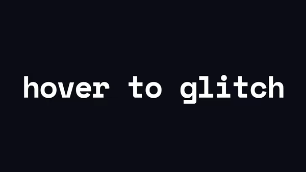
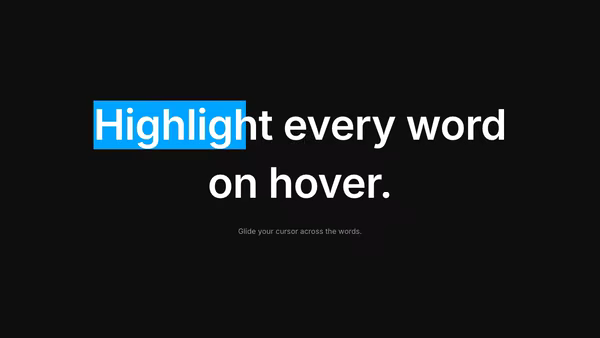
Text Hover Icon
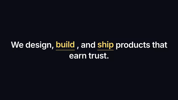
A sentence where designated keywords morph into a glyph on hover and bounce back to text on leave — the words become controls.
Usage
import TextHoverIcon from '@crazygl/hero-text-hover-icon';

export default function Hero() {
  return (
    <TextHoverIcon
      prefix="We"
      keyword1="love" icon1="heart"
      between="what we"
      keyword2="build" icon2="spark"
      suffix="."
    />
  );
}
Customise
- Content —
prefix,keyword1+icon1,between,keyword2+icon2,suffix. Icons: heart, star, spark, bolt, smile, music, eye. - Behaviour —
idleLoop(auto-demo hover when no pointer is present). - Typography —
textColor,iconColor,fontSize,headingFontFamily,headingFontWeight. - Backdrop —
transparentBackground,bgColor.
Best for
- Marketing / SaaS statement headlines with a playful twist.
- Brand and agency landing heroes.
- Product taglines where keywords double as iconography.
One command, zero config.
npm install @crazygl/hero-text-hover-iconImport once, drop it in.
The component takes the same props you see in the live customizer on the right — every default ships poster-quality.
import TextHoverIcon from '@crazygl/hero-text-hover-icon';

export default function Landing() {
  return (
    <TextHoverIcon />
  );
}SSR-safe by default.
The wrapper renders static HTML on the server and only initialises the canvas after hydration, so search engines see your copy.
// app/page.tsx — works in SSR-first frameworks (Next, Remix, Astro, etc.)
'use client';

import TextHoverIcon from '@crazygl/hero-text-hover-icon';

export default function Page() {
  return (
    <section>
      <TextHoverIcon
        heading="Say hi."
        subheading="Your new hero."
      />
      <article>
        <h2>Welcome</h2>
        <p>Your content keeps its own voice below the hero.</p>
      </article>
    </section>
  );
}