 CrazyGL
Hover Text Highlight
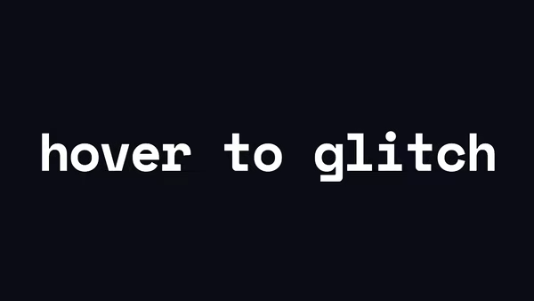
A heading whose words light up on hover — a coloured backdrop wipes in from one side, and out the other when the cursor leaves. Pick Background (full bleed) or Underline (band only).
Usage
import HoverTextHighlight from '@crazygl/hero-hover-text-highlight';

export default function Page() {
  return (
    <HoverTextHighlight
      heading={"Highlight every word\non hover."}
      hoverStyle="Background"
      wipeDirection="leftToRight"
      effectColor="#01a3ff"
    />
  );
}
Customise
- Effect —
hoverStyle(Backgroundfull-bleed vsUnderlineband),wipeDirection(leftToRight/rightToLeft),transitionDuration(snappy at 0.3s, luxurious at 0.6s+),underlineThickness,previewAutoHover. - Colours —
textColor(heading at rest),effectColor(the highlight band). - Typography —
textAlign,fontSize,lineHeight,letterSpacing,headingFontFamily,headingFontWeight. - Backdrop —
bgColor,transparentBackgroundto compose over the page.
Best for
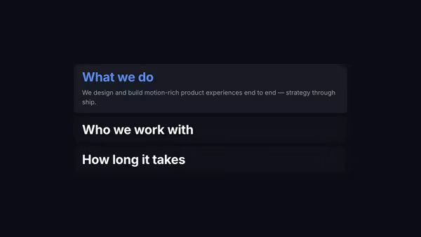
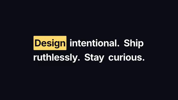
- Editorial and portfolio landing pages where the headline invites interaction
- Brand mission statements and "We do X. Y. And Z." product pages
- Agency / studio site headers and tech-blog hero stories
One command, zero config.
npm install @crazygl/hero-hover-text-highlightImport once, drop it in.
The component takes the same props you see in the live customizer on the right — every default ships poster-quality.
import HoverTextHighlight from '@crazygl/hero-hover-text-highlight';

export default function Landing() {
  return (
    <HoverTextHighlight />
  );
}SSR-safe by default.
The wrapper renders static HTML on the server and only initialises the canvas after hydration, so search engines see your copy.
// app/page.tsx — works in SSR-first frameworks (Next, Remix, Astro, etc.)
'use client';

import HoverTextHighlight from '@crazygl/hero-hover-text-highlight';

export default function Page() {
  return (
    <section>
      <HoverTextHighlight
        heading="Say hi."
        subheading="Your new hero."
      />
      <article>
        <h2>Welcome</h2>
        <p>Your content keeps its own voice below the hero.</p>
      </article>
    </section>
  );
}