 CrazyGL
Dynamic Fill Nav
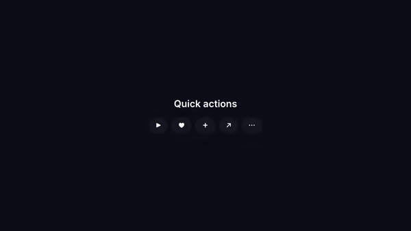
A nav bar where each link reveals a coloured fill on hover — left-to-right wipe behind a flat-coloured label.
Usage
import DynamicFillNav from '@crazygl/hero-dynamic-fill-nav';

export default function Hero() {
  return (
    <DynamicFillNav
      items={`Work | /work\nProcess | /process\nContact | /contact`}
      fillColor="#5b8def"
    />
  );
}
Customise
- Links —
items: onelabel | hrefpair per line. - Style —
textColor,fillColor(wipe colour),fillTextColor(hover text),fontSize,headingFontFamily,headingFontWeight. - Backdrop —
transparentBackground,bgColor.
Best for
- Portfolio and studio landing pages with a strong typographic menu.
- Single-page sites that use the nav itself as the hero.
- Minimal brand sites wanting a tactile hover interaction.
One command, zero config.
npm install @crazygl/hero-dynamic-fill-navImport once, drop it in.
The component takes the same props you see in the live customizer on the right — every default ships poster-quality.
import DynamicFillNav from '@crazygl/hero-dynamic-fill-nav';

export default function Landing() {
  return (
    <DynamicFillNav />
  );
}SSR-safe by default.
The wrapper renders static HTML on the server and only initialises the canvas after hydration, so search engines see your copy.
// app/page.tsx — works in SSR-first frameworks (Next, Remix, Astro, etc.)
'use client';

import DynamicFillNav from '@crazygl/hero-dynamic-fill-nav';

export default function Page() {
  return (
    <section>
      <DynamicFillNav
        heading="Say hi."
        subheading="Your new hero."
      />
      <article>
        <h2>Welcome</h2>
        <p>Your content keeps its own voice below the hero.</p>
      </article>
    </section>
  );
}