 CrazyGL
Cursor Reveal Text
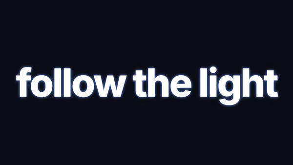
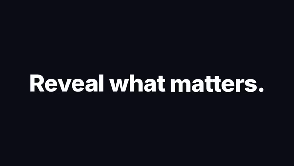
Two stacked paragraphs — a primary line shown in the surface colour, and a secret reveal line shown only inside a cursor-following spotlight that grows on hover.
Usage
import CursorRevealText from '@crazygl/hero-cursor-reveal-text';

export default function Page() {
  return (
    <CursorRevealText
      primaryText="I'm a selectively skilled product designer..."
      revealText="Crafting elegant solutions through code..."
      hoverSize={400}
    />
  );
}
Customise
- Content —
primaryText,revealText. - Spotlight —
defaultSize(resting diameter),hoverSize(diameter over text),cursorFollowSpeed(0.05 liquid → 1 snaps),transitionDuration(grow/shrink ease). - Colours —
bgColor,textColor,revealBgColor,revealTextColor; pair contrasting hues for the strongest effect. - Typography —
fontSize,lineHeight,maxWidth,headingFontFamily,headingFontWeight.
Best for
- Portfolio bio and "about" sections with a hidden punchline
- Agency / studio personality blocks and case-study intros
- Interactive landing pages that reward cursor exploration
One command, zero config.
npm install @crazygl/hero-cursor-reveal-textImport once, drop it in.
The component takes the same props you see in the live customizer on the right — every default ships poster-quality.
import CursorRevealText from '@crazygl/hero-cursor-reveal-text';

export default function Landing() {
  return (
    <CursorRevealText />
  );
}SSR-safe by default.
The wrapper renders static HTML on the server and only initialises the canvas after hydration, so search engines see your copy.
// app/page.tsx — works in SSR-first frameworks (Next, Remix, Astro, etc.)
'use client';

import CursorRevealText from '@crazygl/hero-cursor-reveal-text';

export default function Page() {
  return (
    <section>
      <CursorRevealText
        heading="Say hi."
        subheading="Your new hero."
      />
      <article>
        <h2>Welcome</h2>
        <p>Your content keeps its own voice below the hero.</p>
      </article>
    </section>
  );
}